Mimi Zeiger

Critic, editor, curator and instigator.

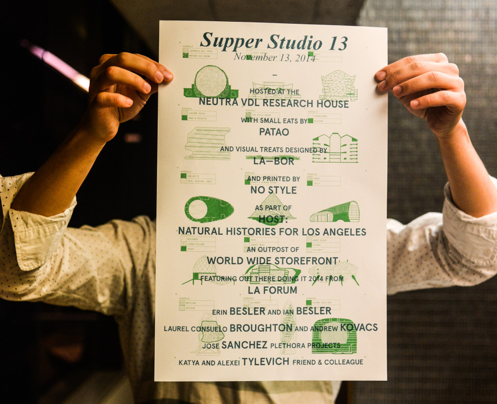
Host curators are Mimi Zeiger (Los Angeles Forum for Architecture and Urban Design), Leonardo Bravo and River Jukes-Hudson (Big City Forum), and Sarah Lorenzen (Neutra VDL Research House).

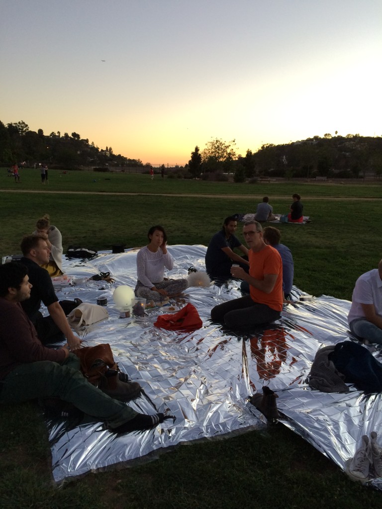
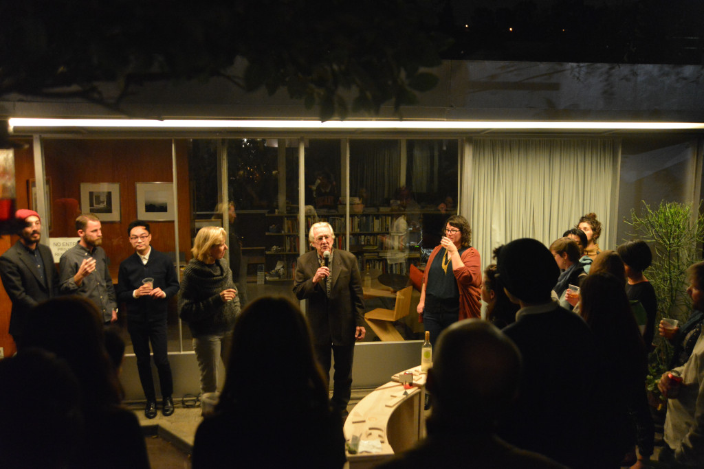
This fall, curators from three Los Angeles-based organizations come together as part of World Wide Storefront, a Storefront for Art and Architecture project, to present Host: Natural Histories for Los Angeles. This series of exhibitions and events is a collaboration between Big City Forum, Los Angeles Forum for Architecture and Urban Design, and the Neutra VDL Research House.

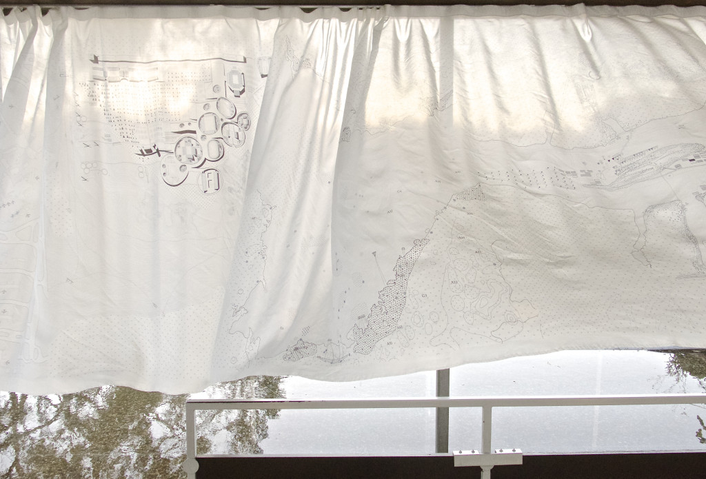
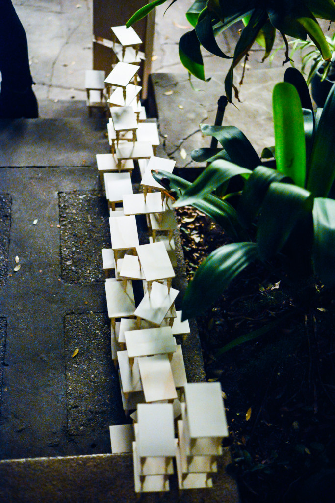
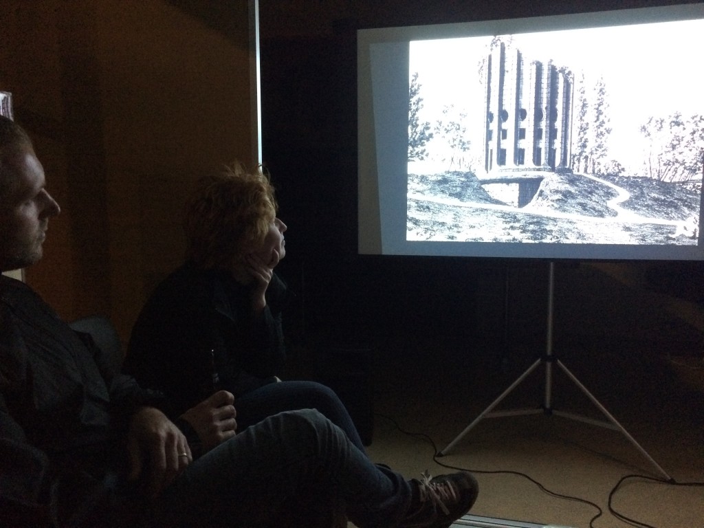
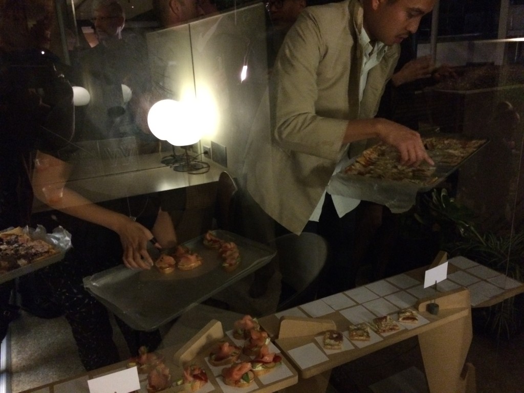
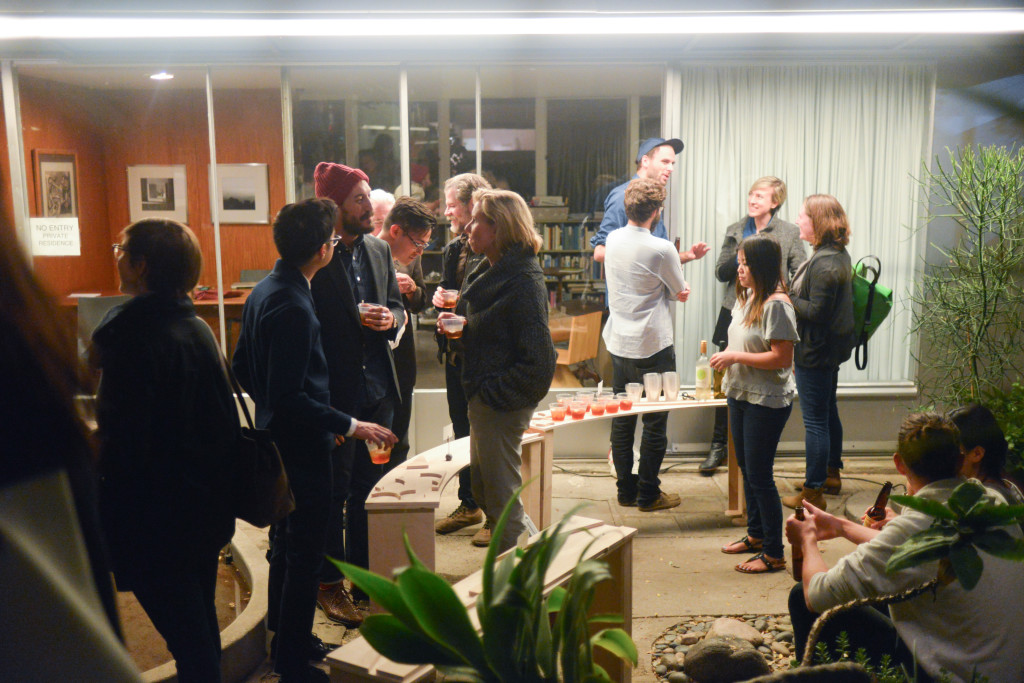
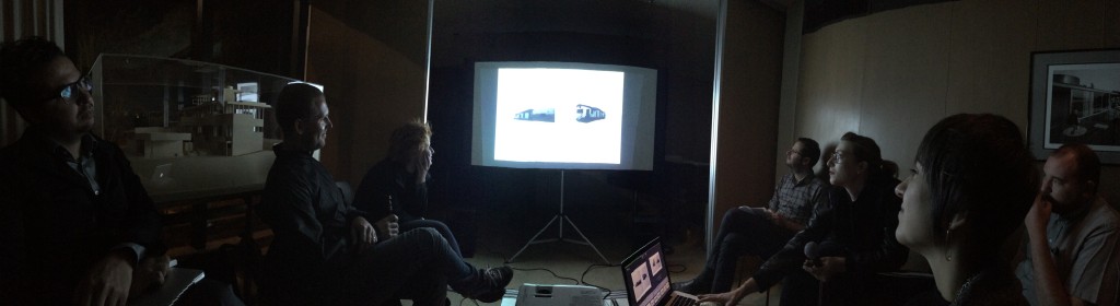
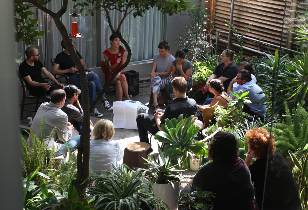
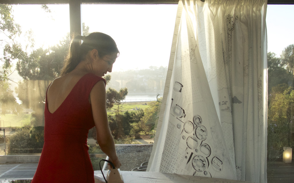
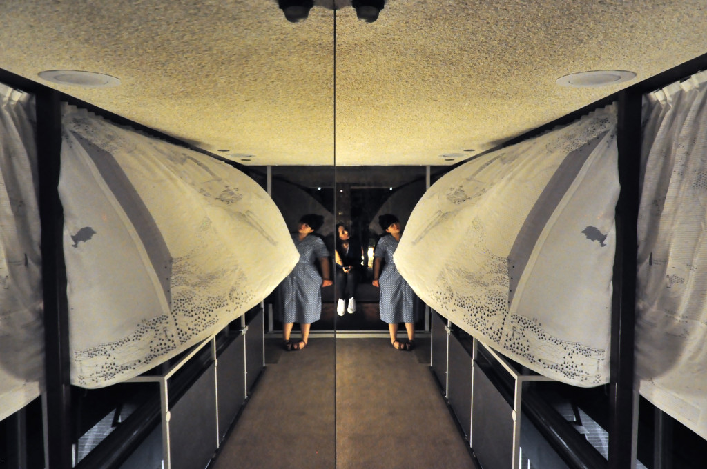
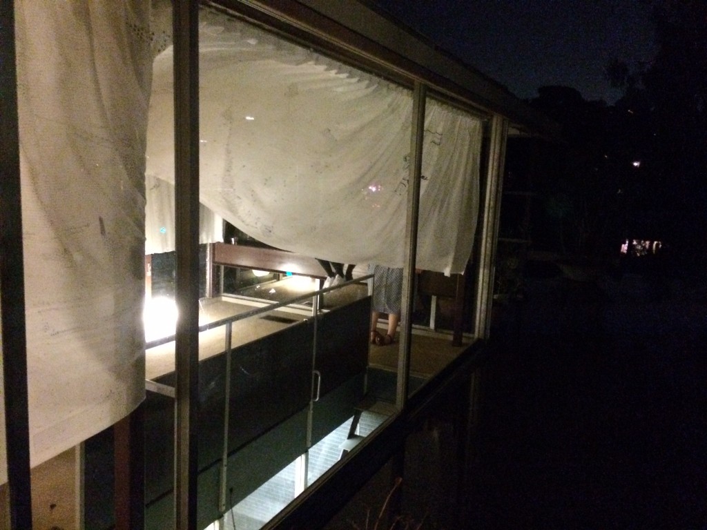
Host: Natural Histories for Los Angeles explores the multivalent meaning of “host” though spectacle, parasitic opportunism, and domestic landscapes. The Neutra VDL Research House serves as the site of these investigations and the house, embedded with spatial effects—mirrors, screens, and pools of water—heightens and confuses the relationship between the domestic interior and the exterior.  Read More …

Let’s get this bit out of the way: Mexico City is dense, Mexico City is colourful, and Mexico City is a place of contrasts. That is to say, in a haze of pollution you can eat tapas on the roof of a boutique hotel designed by Enrique Norton – or scoff down quesadillas on the street, sheltered by a tarp hung between a fence and a lamp post. The city’s famous outdoor markets sell local crafts and produce alongside imported Chinese sundries. Icons of Mexican modernism are tangled in an urban fabric dating back centuries. For a number of young architects, designers, and curators practicing in its colonias (neighbourhoods), Mexico City is more than clichéd observation; it’s an opportunity to refashion the narrative. Read More …

How many women? That’s the question I routinely ask when faced with a lineup of panelists, a competition jury, an exhibition checklist, or a table of contents. Then I will count, picking out female names and remembering which offices are partnerships.

I’m not alone in my inventory. For (en)Gendered (in)Equity: The Gallery Poster Project, Micol Hebron asked fellow artists to contribute posters depicting the numbers of male and female artists represented by top galleries in Los Angeles. Read More …

Today the feedback, spin, and other acts of interpretation that were once the preserve of historians and other experts are often virtual, instantaneous, and open to input from a broad audience. What does this mean? Mimi Zeiger, critic and journalist based in Los Angeles, will consider expanded models of architectural criticism and discursive platforms. Alexandra Lange, New York-based critic and 2014 Loeb Fellow, will explain why architects should use Twitter and Instagram to show their influences—what they read, the design pilgrimages they make, the colleagues they admire—not just to promote themselves. Florencia Rodriguez, editor of Plot (Buenos Aires) and 2014 Loeb Fellow, will explore the question of criticism’s social or disciplinary responsibility; should it be “useful”? A discussion will follow, with GSD student writers and bloggers.

Moderated by Shantel Blakely of Harvard GSD Public Programs.

(136)
#platform = collaboratively produced publication by SVA summer design writing intensive participants, with Mimi Zeiger & Neil Donnelly.

(128)
Freedom of expression within tight constraints: An anthology of thoughts and observations give voice to the collective experience.

(135)
Moving from digital to analog, it presents conversational, observational, narrative, and critical tweets produced during the Intensive.

(130)
Time is of the essence. Dérive tweets get tagged and bagged. Narratives are shared. Meaning created with collective intelligence.

(137)
We distilled two weeks of collective experiences, conversations, and relationships (more than 1,000 tweets), curating 68 for this volume.

(139)
Interdisciplinary curation means staying true to a collaborative direction, allowing for a spontaneous selection of educated critiques.

(122)
Potential sound of a tweet: quality of tone, incisive critical pitch, the volume that can be generated with 140 characters.

(131)
Herein lies the mystical divining rod of the Intensive. A retroactive guidebook to city-slicking, quotable-quotes, and D-Criticism.

(83)
#platform’s physical documents navigate back into the city, lingering as messages.

The School of Visual Arts Design Writing and Research Intensive offers students and working professionals a unique opportunity to study closely with a faculty composed of leading writers, editors, researchers, curators and bloggers. Participants spend two weeks in the SVA MFA Design Criticism studio learning how to write compellingly about images, objects and spaces and are introduced to a range of writing genres and a spectrum of methods and formats.

Faculty and lecturers include: Steven Heller, Alice Twemlow, Adam Harrison Levy, Karrie Jacobs, Paul Lukas, Justin Davidson, Mimi Zeiger, and Jennifer Kabat.

Click to download a copy.

“California design is not a superimposed style, but an answer to present conditions….It has developed out of our own preferences for living in a modern way,” explained architect and designer Greta Magnusson Grossman in 1951. Casually, she captured the essence of midcentury West Coast design—a movement built on climatic, economic, and technological responses to Los Angeles combined with a non-doctrinaire embrace of modernism. It’s her quote that opens California Design, 1930–1965: “Living in a Modern Way,” the latest exhibition at the Los Angeles County Museum of Art (LACMA). Read More …

Woodbury School of Architecture’s visual identity is a system of fonts, colors, and typographic parameters. As such, there is no singular logo, but a series of graphic processes that evolve with each designer. Design ideas are passed from one designer to another in a kind of “exquisite corpse” game.

Color are bold and saturated, with cyan, red, and black at the core of the palette. Other primary brights and fluorescents are also included. Fonts are constrained to san serif families, such as Helvetica, Futura DB Brown, and Wedding.

Within this system there is a play between the white space of the page and geometric shapes, beginning with the Platonic solids: squares, circles, triangles. Other shapes are introduced as counterpoints of difference and complexity to these ideal forms. Additionally, there references to Los Angeles iconic artists John Baldessari and Ed Rusha are encouraged.

The goal is to create a design direction that is both playful and rigorous. It celebrates the building blocks and complexity of architectural design. Image choices focus on thinking through making and process, with an emphasis on students in the architectural educational environment and on site visits in order to underscore the importance of Southern California as place rich in design history and inspiration.

graphic designers
Luke Bulman, Thumb Projects
Juliette Bellocq, Handbuilt Studio
Glen Cummings, MTWTF
Neil Donnelly
Forest Graham
Mike Manalo, Rare Studio
Mark Owens, The Life of the Mind
Nick Steinhardt, 23inc

There’s nothing that so thoroughly represents the sweet spot between culture and consumption in our current zeitgeist than the pop-up. Cheap, flexible, and low-risk, it’s the go-to model for galleries, shops (both entrepreneurial DIY and haute retail brands), and restaurants. Pop-ups mushroom in New York, London, and Berlin, even as economic bubbles burst. When retail vacancy rates hit soaring heights in 2009, the pop-up went from being a strategic action practiced by arts groups to a global phenomenon embraced by entrepreneurial types and corporate brands alike. Arts organization No Longer Empty may install contemporary art exhibitions in vacated storefronts, but their pop-up mission was dwarfed in scale last holiday season when Toys R Us opened 600 temporary 2,500 square foot stores across the country—a total of 1.5 million square feet of provisional real estate. Read More …

A squat retail building in New Orleans’ Marigny neighborhood sits empty. Delta Countertops & Cabinets, its last tenants, are long gone, and the storefront is tagged with graffiti, including baby blue cursive spelling out “Sauce!” A glossy poster, roughly two-feet-high by four-feet-wide, hangs off center on the metal siding. The poster features a cheery illustration that might portend new development — housing, perhaps, or a revived commercial strip to replace the down-on-its-luck building? Closer inspection of the colorful rendering reveals a new future for the rundown structure. In the illustration the building is transformed into an ersatz mobile grocery. It’s raised high in the air and mounted on the back of a pickup; there’s a cascade of jumbo shrimp tumbling out of it. Airborne bananas and giant carrot-shaped street benches add to a festive composition. In the upper right hand corner is a logo and the enigmatic words: The Hypothetical Development Organization.

The poster is fiction.

But it is also a commentary on the need for grocery stores in underserved communities. Conceived by graphic designer/urban planner Candy Chang, and entitled Mobile Cornucopia, it is a piece in the new collective art project, The Hypothetical Development Organization (H.D.O.). Read More …