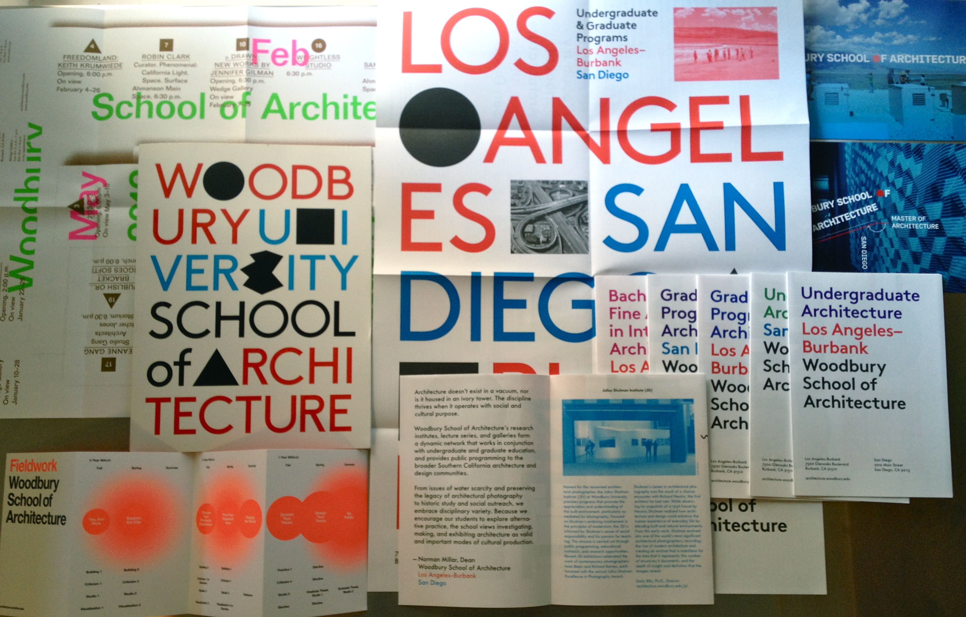
Woodbury School of Architecture’s visual identity is a system of fonts, colors, and typographic parameters. As such, there is no singular logo, but a series of graphic processes that evolve with each designer. Design ideas are passed from one designer to another in a kind of “exquisite corpse” game.
Color are bold and saturated, with cyan, red, and black at the core of the palette. Other primary brights and fluorescents are also included. Fonts are constrained to san serif families, such as Helvetica, Futura DB Brown, and Wedding.
Within this system there is a play between the white space of the page and geometric shapes, beginning with the Platonic solids: squares, circles, triangles. Other shapes are introduced as counterpoints of difference and complexity to these ideal forms. Additionally, there references to Los Angeles iconic artists John Baldessari and Ed Rusha are encouraged.
The goal is to create a design direction that is both playful and rigorous. It celebrates the building blocks and complexity of architectural design. Image choices focus on thinking through making and process, with an emphasis on students in the architectural educational environment and on site visits in order to underscore the importance of Southern California as place rich in design history and inspiration.
graphic designers
Luke Bulman, Thumb Projects
Juliette Bellocq, Handbuilt Studio
Glen Cummings, MTWTF
Neil Donnelly
Forest Graham
Mike Manalo, Rare Studio
Mark Owens, The Life of the Mind
Nick Steinhardt, 23inc