“California design is not a superimposed style, but an answer to present conditions….It has developed out of our own preferences for living in a modern way,” explained architect and designer Greta Magnusson Grossman in 1951. Casually, she captured the essence of midcentury West Coast design—a movement built on climatic, economic, and technological responses to Los Angeles combined with a non-doctrinaire embrace of modernism. It’s her quote that opens California Design, 1930–1965: “Living in a Modern Way,” the latest exhibition at the Los Angeles County Museum of Art (LACMA). Read More …
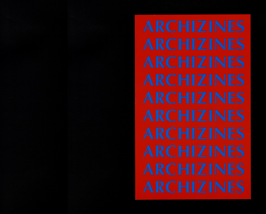
Edited by Elias Redstone
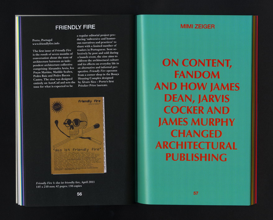
From handmade fanzines and print-on-demand news-letters to magazines and student journals, ARCHIZINES celebrates the recent resurgence of alternative and independent architectural publishing. Edited by Elias Redstone, ARCHIZINES showcases 60 new publications from over 20 countries alongside critical texts from Pedro Gadanho (Beyond), Iker Gil (MAS Context), Adam Murray (Preston is my Paris), Rob Wilson (Block), Mimi Zeiger (Maximum Maxim MMX / loudpaper) and Matthew Clarke, Ang Li & Matthew Storrie (PIDGIN) that explore the relationship between architecture and publishing today. Themes addressed include the role of publishing in academia and architectural practice, and the representation of architecture in fictional writing, photography, magazines and fanzine culture. Read More …
Keynote Speaker
The BIG FEED is an annual event and action held by M12. It is a celebration of the regional landscape, experimental art and architecture, food, music, culture and community. It is a forum to connect community members and artists in a casual atmosphere, as well as an opportunity for the larger public to learn more about the groundbreaking work presented by the attending community members, artists, musicians, critics, and curators. Landing somewhere between a family reunion, potluck dinner, symposium, and festival, The BIG FEED is held the second weekend in every October. The event is open to the public and the cost of entry is one food item to share.
2011
October 15-16, 2011
Location: Yuma County Fairgrounds in Yuma, Colo.
Mimi Zeiger (Los Angeles, CA)
Blue Mountain (Oxford, MS)
Yuma County Rodeo Queens
Matthew Fluharty (St. Louis, MO)
Vic Anderson (Estes Park, CO)
Gregory Hill (Joes, CO native)
Eric Steen (Colo. Springs, CO)
Ro Guenzel (Longmont, CO)
4H Royalty (Denver, CO)
Jami Lunde (Lyons, CO)
DJ Rockcrusher (Maiden Rock, WI)
CU Art Students (Boulder, CO)
Click here for the full 2011 schedule of events.
Based, in Bologna, Italy, Blu creates politically charged murals, borrowing visual inspiration from the Surrealists. Using house paint and rollers to draw human figures, Blu often comments on the exploitation of natural resources. Graffiti artists have long used video to document their ephemeral work, but Blu’s videos thoroughly reinvent the practice. In his digital stop-motion films, he animates his figures frame by frame, and the drawings appear to come to life as Blu paints out each old image and creates a new one.
Swoon’s artwork stand out in a street art world that’s oft populated with brash, pop art figures. Where some of her guerrilla colleagues fill walls with Andre the Giants, cartoon characters, and Andy Warhol wannabes, she creates life-sized paper cut outs of everyday people, realistic rendered in black and white. With her bike nearly for a quick getaway, she wheat pastes these enigmatic souls—women, children, mermaids—at eye level where they interact with people who happen by. Born in Daytona Beach, Florida and trained in fine-arts at Brooklyn’s Pratt Institute, Swoon’s illustrations and hand-cut paperwork draw on formal and folk traditions—German Expressionist and Japanese wood block printmaking, Mexican papel picado, and Wayang Kulit, the shadow puppets from Central Java. Read More …
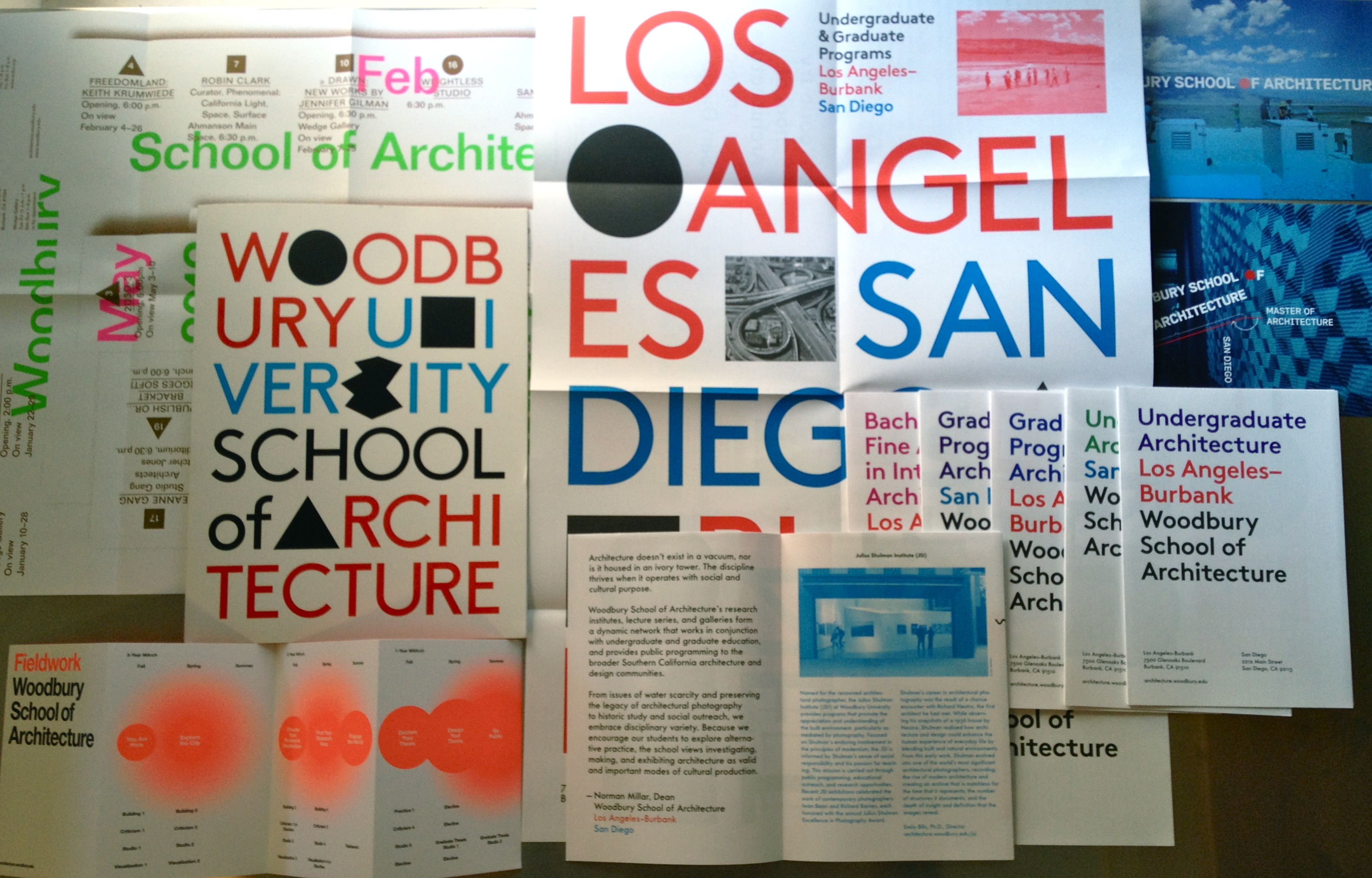
Woodbury School of Architecture’s visual identity is a system of fonts, colors, and typographic parameters. As such, there is no singular logo, but a series of graphic processes that evolve with each designer. Design ideas are passed from one designer to another in a kind of “exquisite corpse” game.
Color are bold and saturated, with cyan, red, and black at the core of the palette. Other primary brights and fluorescents are also included. Fonts are constrained to san serif families, such as Helvetica, Futura DB Brown, and Wedding.
Within this system there is a play between the white space of the page and geometric shapes, beginning with the Platonic solids: squares, circles, triangles. Other shapes are introduced as counterpoints of difference and complexity to these ideal forms. Additionally, there references to Los Angeles iconic artists John Baldessari and Ed Rusha are encouraged.
The goal is to create a design direction that is both playful and rigorous. It celebrates the building blocks and complexity of architectural design. Image choices focus on thinking through making and process, with an emphasis on students in the architectural educational environment and on site visits in order to underscore the importance of Southern California as place rich in design history and inspiration.
graphic designers
Luke Bulman, Thumb Projects
Juliette Bellocq, Handbuilt Studio
Glen Cummings, MTWTF
Neil Donnelly
Forest Graham
Mike Manalo, Rare Studio
Mark Owens, The Life of the Mind
Nick Steinhardt, 23inc
This spring I presented The Interventionist’s Toolkit at a symposium hosted by the University of Sydney’s Faculty of Architecture, Design and Planning. The Right to the City, which featured an exhibition along with the symposium, brought together architects, artists, historians, theorists and journalists; organized by architect Lee Stickells and artist Zanny Begg, the program took geographer David Harvey’s 2008 essay “The Right to the City” — with its evocation of Henri Lefebvre’s influential 1968 book — as its critical springboard. As Harvey wrote: “The freedom to make and remake our cities and ourselves is, I want to argue, one of the most precious yet most neglected of our human rights.” [1]
In recent years this argument has become a rallying cry for activists who oppose the neoliberal politics and policies of the contemporary city. There’s a romantic appeal, maybe even a sense of imminent empowerment, in the prospect of remaking our cities and thus ourselves — a notion that if we change our environments we will change our lives, or vice versa. But ever since the symposium, I’ve been wondering about how we might evaluate the results of those freedoms. How to rate the diverse architectural actions and urban interventions that seek to remake the city? Do knitted cozies for stop signs or street furniture made from discarded pallets rank higher or lower than municipal cultural events? How do we measure the impacts of ambiguously defined and informal activities that are not only creative and civic but also — lest we forget Harvey’s ourselves — emotionally charged?
There’s nothing that so thoroughly represents the sweet spot between culture and consumption in our current zeitgeist than the pop-up. Cheap, flexible, and low-risk, it’s the go-to model for galleries, shops (both entrepreneurial DIY and haute retail brands), and restaurants. Pop-ups mushroom in New York, London, and Berlin, even as economic bubbles burst. When retail vacancy rates hit soaring heights in 2009, the pop-up went from being a strategic action practiced by arts groups to a global phenomenon embraced by entrepreneurial types and corporate brands alike. Arts organization No Longer Empty may install contemporary art exhibitions in vacated storefronts, but their pop-up mission was dwarfed in scale last holiday season when Toys R Us opened 600 temporary 2,500 square foot stores across the country—a total of 1.5 million square feet of provisional real estate. Read More …
21st century advances in engineering and technology have lead to the creation of the most fascinating design and architectural projects ever imagined. However, in this desire for progress, we often forget about the psychological and even architectural barriers that some humans face when considering living and working in these amazing spaces. For some people, these barriers are true obstacles, for others they become an enticing challenge to better this world of modern design to ensure that all can access and take equal enjoyment of it. The development of projects that fully consider accessibility from the initial concept stages is an important and major concern for many architects. Most important today is establishing an open communication regarding these issues and their vital importance. We bring you an interview between two prominent experts of architecture who explore the issues and advantages of pushing professionals to think in a more holistic approach to universal access.
Here, Mimi Zeiger, professor, author, founder of loud paper currently, freelance writer and contributing editor to Architect magazine, talks to Michael Graves, globally renowned architect, and household name through his designs for Target stores. Michael, after suffering a health incident that paralyzed him from the waist down, utilized his disability as a vantage point from which to create more accessible architecture and product design. Drawing from his personal experience, Mr. Graves advocates greater access to spaces and products for all humans in a relatable and functional manner that never loses the joyful touch of great design. Read More …
Sanatorium, the inaugural exhibition in the Guggenheim museum’s Stillspotting NYC series of off-site programs, opened in downtown Brooklyn just steps from the intense bustle and hawking of street vendors and discount retailers on Fulton Street Mall and a few blocks from the Brooklyn House of Detention. Created by Pedro Reyes and housed in an unrented space in the Metrotech Center provided by Forest City Ratner, Sanatorium is a “temporary clinic” designed to treat urban ills. It offers a number of therapeutic balms for the anxiety and depression caused city living. Read More …